
Image-led ecommerce has become the default expectation for premium, lifestyle and luxury brands. On modern Shopify stores, imagery is no longer just supporting content; it is often the primary way a brand communicates quality, emotion, craftsmanship and aspiration. Large editorial banners, full-bleed campaign photography, product galleries, lifestyle content, lookbooks, shoppable images and video-like visual storytelling are now common patterns across high-end ecommerce experiences.
For luxury and premium brands in particular, an ecommerce site has to feel as considered as the product itself. Design commentary across luxury ecommerce regularly highlights high-quality photography, elegant visual hierarchy, minimalist layouts, strong storytelling and seamless user journeys as defining characteristics of premium digital experiences. Sites in this space often use large hero imagery, full-screen video or photography-led landing pages, refined typography and spacious layouts to create a sense of exclusivity and emotional connection.

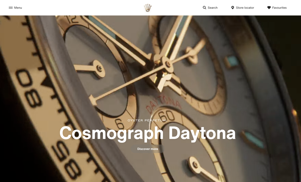
Image-heavy stores introduce a performance challenge: every visual asset has a cost. Large unoptimised images increase page weight, slow down Largest Contentful Paint, delay perceived load time and can negatively affect conversion, mobile experience and search performance.
Shopify provides a strong foundation through its CDN and image transformation capabilities, but clients still need to prepare, size and manage assets carefully before upload.
Why Image Optimisation Matters on Shopify
Images are often among the heaviest assets on ecommerce pages, especially on product detail pages, collection pages, campaign landing pages and homepage hero sections. Shopify’s own theme performance guidance states that performance directly influences conversion rates, repeat business and search engine rankings. Shopify also advises theme developers to build with performance in mind, with image loading, JavaScript usage and rendering behaviour all contributing to storefront speed.
For image-led brands, the goal is not to reduce visual quality to the point where the experience feels compromised. The goal is to deliver the right image, at the right dimensions, in the right format, at the right time.
A luxury homepage still needs rich photography, but a mobile visitor should not be forced to download a 6000px desktop campaign image, as the rendered viewport only needs a much smaller version.
Good Shopify image optimisation improves:
- Page speed — smaller and better-sized images download faster.
- Largest Contentful Paint — hero images are often the LCP element.
- Mobile experience — smaller assets matter more on constrained networks.
- SEO — performance and well-written alt text both support discoverability.
- Conversion — faster browsing reduces friction in product discovery.
- Operational consistency — agreed upload standards reduce ad hoc performance issues over time.
How Shopify’s CDN Delivers Image Content
Shopify includes a global content delivery network for storefront assets. Its CDN is designed to host, transform, compress and deliver image files quickly from distributed edge infrastructure. Shopify describes its CDN as supporting file compression, file format conversion and dynamic editing, including real-time transformations such as resizing and cropping without destructively changing the original uploaded asset.
When an image is uploaded to Shopify, the original file is stored and can then be requested in different transformed variants.
Theme code can use Shopify’s Liquid image filters, particularly image_url, to request a specific width, height, crop or other transformation. You can find a list of attributes that you can use within Liquid to do this; https://shopify.dev/docs/api/liquid/filters/image_url
Shopify can also serve modern image formats where supported. Shopifyautomatically detects supported client-side file formats and can deliver WebP or AVIF where supported, with JPG as a fallback for other clients. This means the browser’s capabilities can influence the final file delivered, helping reduce transfer size without merchants having to manually create every format variant.
A simplified request flow looks like this:
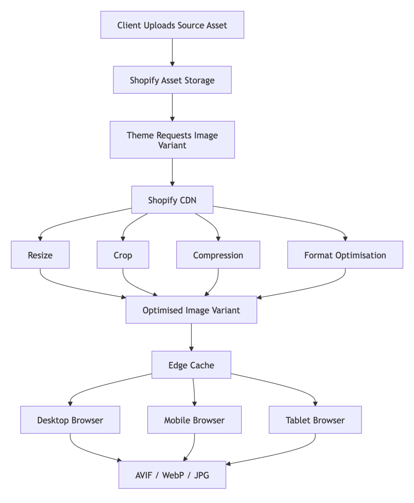
In practical Shopify theme development, this matters because the theme should not simply output the original uploaded file everywhere. Instead, it should request appropriately sized variants. For example:
{{ product.featured_image | image_url: width: 800 }}This asks Shopify’s CDN for an 800px-wide version of the image. Shopify’s image_url documentation confirms that if only width is specified, the height is automatically calculated based on the image’s dimensions.
For responsive images, developers can combine Shopify’s image filters with srcset and sizes, allowing the browser to select the most appropriate image for the user’s viewport and device pixel ratio. Shopify has long recommended responsive image approaches as a way to reduce page loading times, particularly because mobile visitors do not need to download desktop-sized images.
<img
  srcset="
    {% if image.width >= 350 %}{{ image | image_url: width: 350 }} 350w,{% endif %}
    {% if image.width >= 750 %}{{ image | image_url: width: 750 }} 750w,{% endif %}
    {% if image.width >= 1100 %}{{ image | image_url: width: 1100 }} 1100w,{% endif %}
    {% if image.width >= 1500 %}{{ image | image_url: width: 1500 }} 1500w,{% endif %}
    {{ image | image_url }} {{ image.width }}w
  "
  src="{{ image | image_url: width: 1100 }}"
  loading="eager"
  fetchpriority="high"
  width="{{ image.width }}"
  height="{{ image.height }}"
  alt="{{ image.alt | escape }}"
>
What Shopify Optimises Automatically — and What It Does Not
Shopify gives merchants a good baseline, but it is not a complete substitute for good asset preparation.
Shopify can help with:
- CDN delivery from distributed infrastructure.
- Automatic compression to reduce file size without visible quality loss in most cases.
- Dynamic resizing and cropping using URL/Liquid parameters.
- Modern format delivery, including WebP or AVIF where the client supports it.
- Preservation of the original file, so that transformations are non-destructive.
However, clients and implementation teams still need to manage:
- The size and quality of the original uploaded asset.
- Whether the theme requests sensible image dimensions.
- Whether above-the-fold images are prioritised correctly.
- Whether below-the-fold images are lazy loaded.
- Whether product images follow consistent aspect ratios.
- Whether decorative imagery is being overused.
- Whether app-injected images bypass the intended theme logic.
- Whether alt text and filenames are meaningful.
Shopify can optimise delivery, but it cannot fully compensate for poor source assets or poor theme implementation.
Image Optimisations Clients Should Complete Before Uploading to Shopify
1. Resize images to a sensible maximum dimension
Clients should avoid uploading enormous camera-original files unless there is a specific need for zoom-level detail. If an image will never be displayed above 2000px wide, uploading a 6000px file creates unnecessary storage and processing overhead.
As a practical rule:
- Product images: usually export between 1600px and 2400px wide, depending on zoom requirements.
- Collection tiles: often 800px to 1600px wide is sufficient.
- Homepage hero images: typically 2000px to 3000px wide for desktop, with separate mobile crops where possible.
- Logos and icons: use SVG where appropriate, rather than raster images.
Shopify’s image_url filter supports generated widths up to 5760px, but images cannot be enlarged beyond their original dimensions. That means clients should upload large enough files for legitimate use cases, but not unnecessarily huge originals.
2. Use the right file format
Choose the source format based on image type:
- JPEG/JPG — best for photography, lifestyle imagery and product shots without transparency.
- PNG — best for transparency, sharp UI graphics or cases where lossless quality is required.
- SVG — best for logos, icons and simple vector graphics.
- WebP — useful for already-optimised web-ready assets, though Shopify can also deliver modern formats through its CDN where supported.
For most photographic ecommerce imagery, a well-compressed JPEG source is still a sensible and widely compatible upload format, with Shopify then handling transformed delivery to modern formats where appropriate.
3. Compress images before upload
Clients should export images using tools that balance quality and file size. The objective is not maximum compression; it is visually lossless compression. A product image should retain texture, colour and detail, but should not contain unnecessary metadata or excessive quality settings.
Suggested export targets:
- Product listing thumbnails: ideally under 100–200KB where possible.
- Product detail images: often 200–400KB, depending on complexity.
- Hero banners: ideally under 400–700KB, with careful treatment for mobile.
These are not hard limits, particularly for luxury or detail-led brands, but they are useful targets.
4. Create separate crops for mobile and desktop
A common mistake is to use a single wide desktop hero image for all devices. On mobile, this can result in either poor cropping or excessive asset size.
Clients should provide:
- A desktop crop, usually landscape.
- A mobile crop, often portrait or square.
- A clearly defined focal point.
- Safe zones for overlaid text, calls to action and navigation.
This is especially important for luxury campaign imagery, where the subject, model, product or composition may be carefully art-directed.
5. Standardise product image aspect ratios
Inconsistent product image ratios can create layout shifts, uneven grids and awkward cropping. Clients should agree image rules before content population begins.
For example:
- Fashion model photography: 4:5 or 3:4.
- Product packshots: 1:1 or 4:5.
- Lifestyle banners: 16:9 or 21:9.
- Editorial tiles: controlled set of ratios, not arbitrary uploads.
Consistent image ratios help the theme reserve layout space and avoid visual instability.
6. Remove unnecessary metadata
Camera metadata, location data, colour profiles and editing history can increase file size. Before uploading, clients should strip unnecessary metadata while preserving the correct colour profile for web display.
7. Write useful filenames and alt text
Image optimisation is not only about compression. Filenames and alt text support accessibility, SEO and content management.
Instead of:
IMG_9023-final-final-v4.jpgUse:
black-leather-crossbody-bag-front.jpgAlt text should describe the image clearly and naturally, particularly for product images. Shopify’s image object includes an alt property, and Shopify recommends using image_url and image_tag filters to display images in storefront themes.
8. Avoid uploading text-heavy images
Text embedded inside images is difficult to localise, poor for accessibility and can become blurry on small screens. Where possible, campaign text should be rendered as HTML over the image, not baked into the image itself.
This gives the implementation team more control over:
- Responsive typography.
- Accessibility.
- Translation.
- SEO.
- A/B testing.
- Mobile layout.
9. Check colour and quality after compression
Compression should be reviewed visually before upload, especially for luxury brands where material detail, colour accuracy and finish matter. Leather grain, jewellery reflections, fabric texture and cosmetics shades can all be affected by aggressive compression.
Clients should compare:
- Original export.
- Compressed version.
- Mobile preview.
- Product zoom state.
- Dark and light background contexts.
Implementation Recommendations for Shopify Teams
Although this article focuses on client-side image preparation, the Shopify implementation also needs to be correct.
Development teams should:
- Use
image_urlinstead of hardcoded original image URLs. - Specify explicit width or height parameters, because Shopify requires one of these for
image_url. - Use responsive
srcsetandsizes. - Lazy load below-the-fold images.
- Avoid lazy loading the main above-the-fold hero/LCP image.
- Reserve image dimensions to reduce layout shift.
- Audit third-party apps that inject unoptimised media.
- Test templates with Lighthouse, WebPageTest and real device throttling.
Shopify’s performance best-practice documentation makes it clear that performance is central to merchant success and influences conversion, repeat business and search visibility. Image handling should therefore be treated as part of the technical delivery strategy, not as an afterthought during content entry.
Final Thoughts
Image-heavy brand experiences are now a core part of premium ecommerce. For Shopify merchants, this creates a balancing act: the store must feel rich, immersive and visually distinctive, but it must also remain fast, responsive and usable across devices.
Shopify’s CDN provides a strong technical foundation through global delivery, automatic compression, dynamic transformations and modern format support. Its Liquid image tooling allows development teams to request appropriately sized image variants rather than serving oversized originals. But the best results come when clients, designers, content teams and developers all follow a joined-up image strategy.
Make sure you upload high-quality but sensible source assets, let Shopify’s CDN do its job, and ensure the theme requests the right image for the right context.
Image Credit: https://www.shopify.com/stock-photos/photos/photo-of-a-cityscape-with-a-ferris-wheel
Comment or tweet @douglasradburn